2017 State Fair Sketches - 5 years running!


A great, and this time rainy, sketch day at the MN State Fair.  This is my 5th year in a row!

With the rain and humidity my paintings took longer to dry so that changed up my strategy a bit.

These images are in the rough order of execcution with the exception of the pig. I put my favorite first!

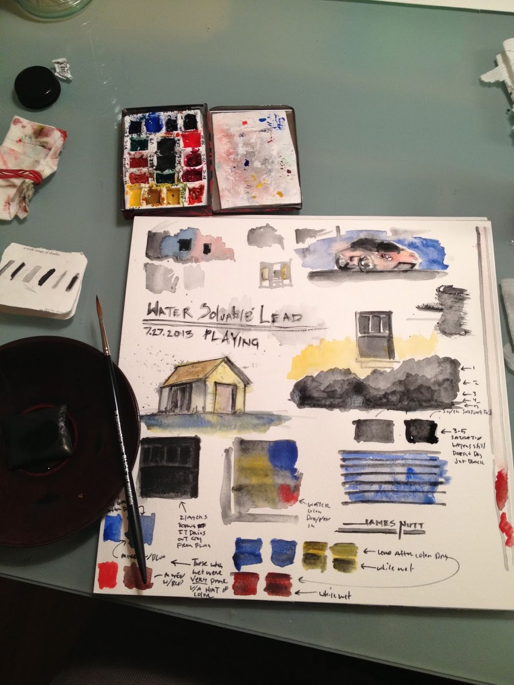
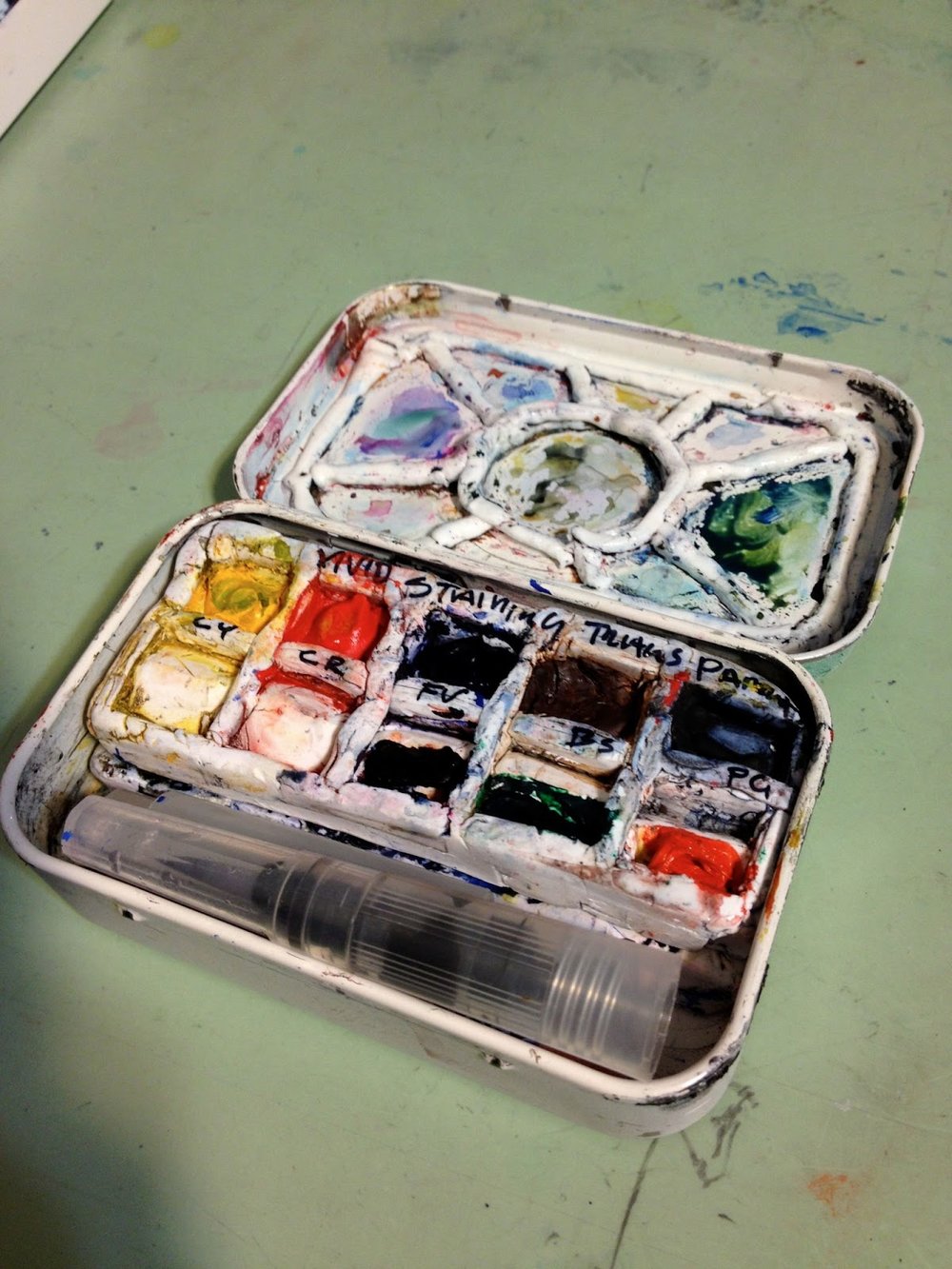
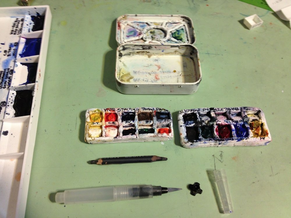
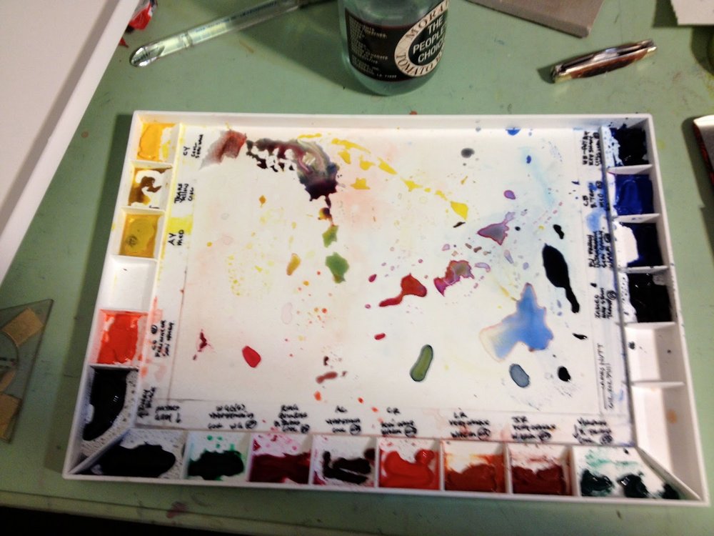
This is mostly from my new paint kit based on Liz Steele's 2017 water color set up.

The book is 8 1/2" x 11" water color paper. Most of these take me between 25 -45 minutes.
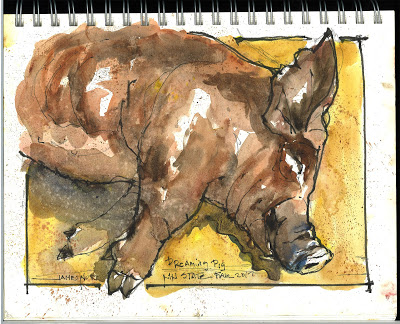
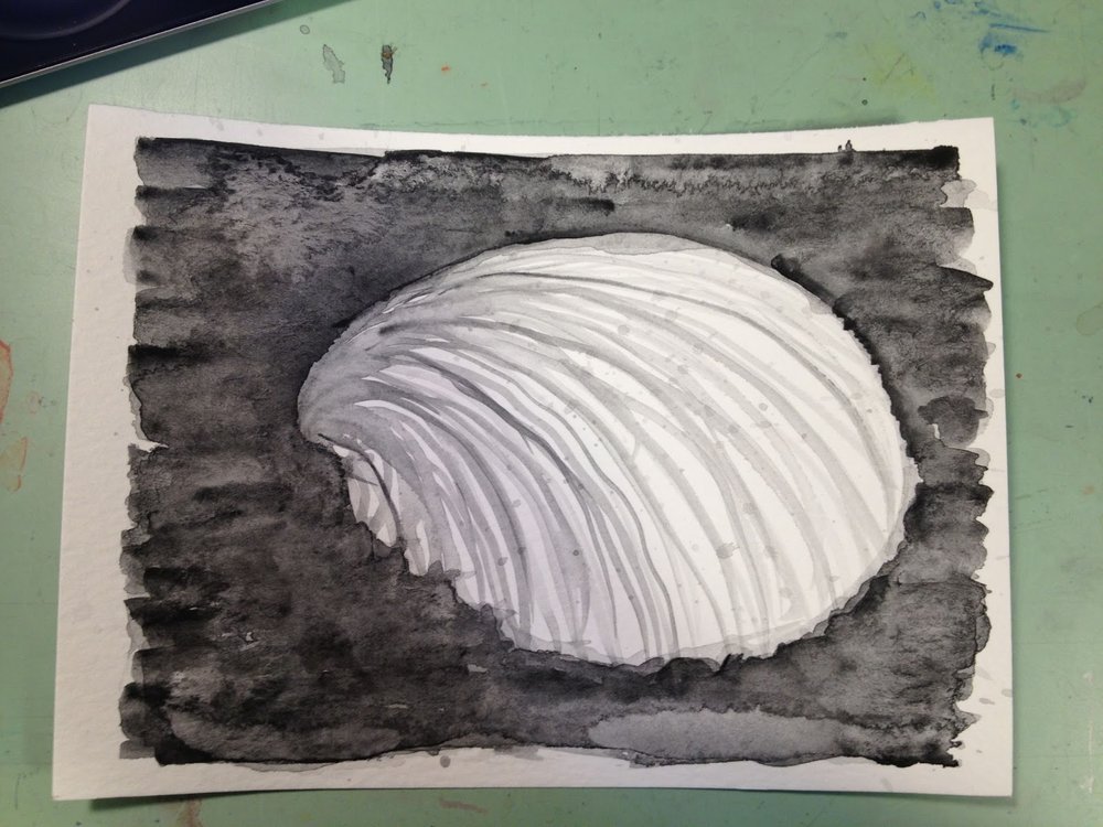
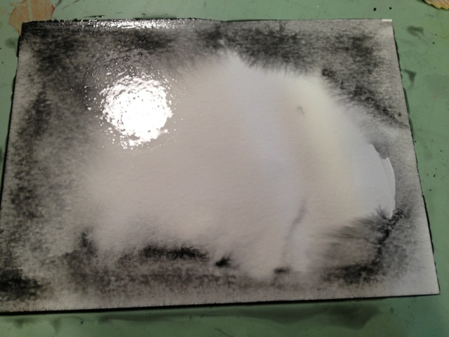
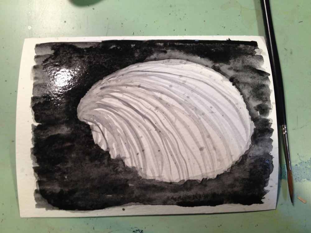
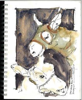


Dreaming Pig

This was my 3rd or 4th drawing in. This was fun because two of the kids who show the pigs had questions while I did the piece. This is my favorite of the bunch and was featured on an MPR post with other beautiful work from sketchers from the same day. How cool is that?


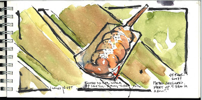
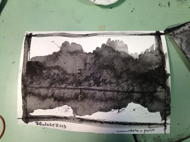
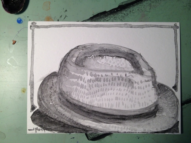
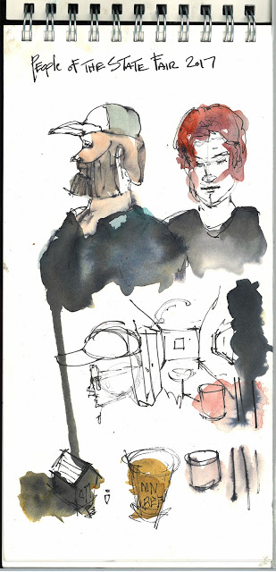
I always start with a Twisted Sister Sausage for my warm up sketch. It was really raining here. Not my favorite sketch (past years were better) but I really learned how the paper and paints were acting will all of rain and humidity. So...it is probably the most valuable sketch of the day.  Certainly the tastiest.


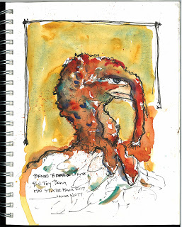
The rain dictated indoor sketches, so this year is animal heavy.  This first sketch was fun because the kid who owned the turkey talked to me a little.  The bird was fun to draw but he wasn't really crazy about me standing there.


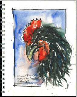
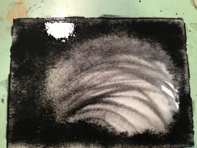
This Rooster most certainly was not crazy about me painting him.  I think that is why is looking a little like an aggressive eagle.  Such a beautiful bird. I was trying to stay loose and capture some of the beautiful colors in the black feathers.  It is always interesting to paint in a high traffic area.  You can see people wanting to ask but not ask.  I always talk to anyone who engages me. I imagine if I wasn't 6'-5", 270# and bald I might get more takers. Despite that I generally wind up having several dozen conversations about the paintings during the day. 


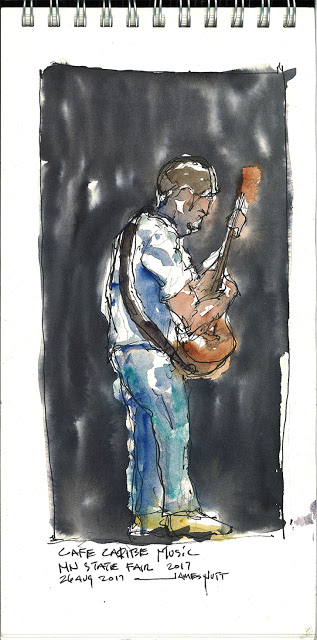
I needed to walk around and let these dry. I finally found an open table mostly out of  the rain and did a quick sketch of this musician as the other two dried and received a few touch ups.


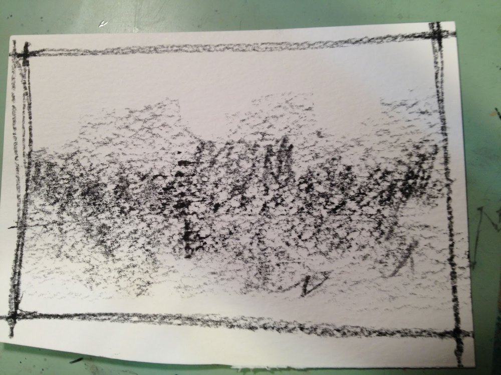
Where the rooster did not want to be painted, these two sheep didn't mind being painted at all.  If you look close you can see rain drops in the pre mixed grey while I walked around waiting for them to dry.


The pig was next. I have drawn a pig every year. I guess it is a thing now.


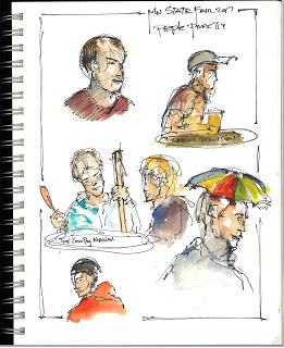
These last two sketches were my wrap up.  It was half an hour before we met as a group and I finally found a covered place to sit.  I typically wrap up with people sketches. This was done sitting with a nice couple who had family showing animals.  I was explaining my kit and sketching nearby people. My favorite was the guy holding the wooden staff in a clear rain coat holding court with a huge corn dog in his hand. So I labeled him "The Corn Dog Messiah"

Thanks to Marty Harris and Roz Stendahl and the Metro Sketchers for organizing!

Anyway, I hope you enjoyed these!


IS SKETCHING RELEVANT TO DESIGN THINKING IN ARCHITECTURE...I SAY YES

Some time ago submitted these 11 X 17 boards to a sketch competition for d3. 2013 submission call.  These boards, along with a1,500 others were hung the Fordham University in NYC.

Since then I have used these boards over and over when the subject of sketching in architecture comes up.

This is a pretty good summary of my work when it comes to design thinking and how it relates to drawing.

I hope you enjoy these.


This first board is about digital sketching. For me it isn't either or.  It is just a different medium. You approach a charcoal drawing differently than an ink wash. It is the same with digital versus traditional media.  Craft is craft.

I do A LOT of travel sketching. As an architect to me it is similar to a musician practicing their favorite artist melody lines. To learn to see (or hear), try to figure out what they were saying and why it worked (or didn't), and especially to remember.

At this point I can walk while drawing and painting.  I can also draw upside down almost as well as right side up.  Somehow my handwriting is so much better than the normal way but it is much slower.


Often times I am in conversations about how to put complex assemblies together.  I have found these types of drawings to really help that conversation along and get past the basics and on to the good ideas from the folks in the field.


As architects, we do a ton of 3d modeling. I set up the basic bones of a building faster in 3d which gives me something accurate to sketch options over. Pick and option, model that, print and sketch over to the next level of detail and options, model and test that, sketch over it....you get the picture but I almost have construction documents when I am done.

This is also a good way to have conversations with multiple trades. The construction folk look at it toward constructability, sequencing, and cost. The owner or developer wants to see the image and the feel along with cost. There are lots of players with different centers of their universe and this lets me communicate in a way to talks to all of them.

Plus.... I just love drawing and use any excuse I can.

Hope you enjoyed this.
Samples of my other work can be found by searching James Nutt and Behance.


A PERSPECTIVE ON COLLECTING ART!

I was asked to post about art collecting from the vantage of an artist . I am happy to do so and will describe what I have learned from my three years of renting a studio in the arts district of NE Minneapolis.


A little back ground so you know where I am coming from. I am an architect by day and an artist by night. Each has a lot to do with creating and drawing in ways that hopefully affect people.  I love both of my jobs, yet they are two jobs so I run a double life and that double life goes well into the evenings!  I also teach art once a week at White Bear Center for the arts.


My advice on collecting and obtaining art is going to have less to do with galleries but more with artist working studio, open studio events and commissions.  Most of my work is primarily shown in my studio and in local restaurants and not galleries primarily because my art life is in the evening and it is hard to network galleries outside of business hours.  As I get closer to retirement I will go this route but for now I paint or draw every day and have my studio open at every opportunity.

There are online galleries such as Invaluable :http://www.invaluable.com/fine-art/pc-SG2BIX3JPJ/, Etsy, Blue Canvas (before they closed),  and my gallery on Behance. Behance is more of a portfolio site and not as much for selling.  I simply need to put more effort into galleries and online, but with my limited time frame if new work is flowing I am going to give precedence to creating and then marketing during any creative ebb.

Open studios are a great place to see how the art is made, meet the artist, and visit repeatedly.  I will often get 3 or 4 visits before someone makes a purchase, but even on these non-purchase visits an artist will thrive on the conversation and encouragement.  It is also interesting to see which pieces get attention!  It certainly changes.


When visiting this is your chance to ask questions and by all means negotiate. When an artist has work in a gallery they have to add the galleries 25%-50% (and higher) commission.  So many people are afraid to throw out a number because they might offend. This not the case and can be fun.  I tend to be firmer on art that is framed because of the work I have in it, my options of where to market it, and your ease of just driving nail and hanging it. 


HOWEVER, at least in my studio, make me an offer on what I haven’t yet framed. I believe that is where the deals are. You will need to go and get it framed and there is expense there, but I love it. The art is my take and the frame makes it fit your house. I am in a constant struggle of what to get framed, and what to just plastic bag.  My wall has a portion of simple clipboards for this work. My happy medium is to matte frame and hinge a piece. It’s affordable to me and allows you to by a stock frame that matches your house.

I believe I make more off of commissions than art off the wall, but that varies through the year.  In NE Minneapolis all of the studios are encouraged to be open on the first Thursday of the month. I believe St Paul does something similar on Fridays.  We have an ever growing ART-A-WHIRL in the spring that will bring 2,000-3,000 people through our studio.  Sales are strange and the crowd is there for the live music and beer as much as art but I typically sell 20-30 small pieces and pick up repeat visitors that turn into commissions through the year.


Also, if you don’t see anything in your price range, tell the artist what your price range is. I promise in a working studio they probably have boxes of studies, or partials that you may dearly love. Some studies are among my favorites but I am not sure others like it enough to give it wall real estate.


Commissions are fun and funny.  It is the difference in seeing something you love and buying it versus paying for something you hope you will love. 
Honest advice on getting the best commission? Give simple direction on what you want and what you love about the artist work but little else. The more freedom you give the artist the easier it is for the artist to do something that sings.  Also even if you see high dollar work on the wall but your budget is $100, be upfront about it. Most artists can work backward on size, or details, etc while still producing something you love.  Your house probably only has so many walls capable of large art anyway.  Even if you can’t come to an agreement, ask away. You have no idea how much the encouragement and interest mean.

BUT, DON’T ask any one to do work for exposure.  Especially here in the cold north you can die of exposure.

Honestly when you buy an artist work, and especially if you buy straight from the artist, you are helping to make this part of persons life possible.

By what you love, and tell the artist you love it. (I also give a discount if I can tell someone is floored by something). If you are going for the working studios route you are more likely to get on the ground floor.

Also I love the quote, “ Please buy from a living artist, the dead ones don’t need the money!”


Links
In my part of North East Minneapolis you can visit a dozen or more great studios but the 3 I am most familiar with are
 My own – Solar Arts Building – http://solarartsbuilding.com/ - about 20 artists and a great community. Indeed Brewery is on the first floor and a great place to start.

Northrup King Building – http://www.northrupkingbuilding.com/ - Huger than Huge and amazing stuff.

Casket Arts building – http://www.casketarts.com/

There are ton more, but one disadvantage of having an open studio is that limits you ability to wander to other peoples studios.


I hope this was helpful.  Love open studios so come and visit and take something home! My door has the big T-Rex on the second floor of the solar arts building. I draw or paint every day so it is always changing.  I am a bit buried in artwork right now and would love get more work out there so don't be afraid to make an offer!

Sketching In Lutsen over Thanksgiving


Traveling to Lutsen

Marcy and  I utilized the Thanksgiving holiday to go to Lutsen to unwind.  On these family trips we always squeeze in a little time to sketch and paint.  I expected there to be more snow on the ground, but the lack of it created a color pallete that kept me painting.

These are a few of the sketches and I hope you enjoy them.


Coffee cup sketch.


Duluth Cafe
 
 
If you haven’t been to Duluth Grill you will never find it on your own. It is fantastic and the comfort food has a foody twist to it. They also have a wide range of fantastic local art.  Their coffee mugs are made by a local artist and a good warm up painting to start the trip.

 
Lutsen Totem
Most of the wood columns around the lodge are carved in an abstract Totem theme. During dinner I was able to study this a little. I noticed it other place around the property and I wonder who first came up with it.


My Breakfast View

This is the view I spent a lot of time with looking at Lake Superior. I spent a lot of time at this table painting.


Gondola ride
 

Adam in our office suggested that we go to the ski hill and take the Gondola ride up the mountain to a restaurant bar.  The Gondolas are exactly the same as at the state fair but the ride is a lot more extreme.  Straight up this cliff to incredible views.  We had the whole family painting up here. I was able to get several smaller pieces done. The food was just OK but the location was spectacular.


Lutsen Grass 

I mentioned the colors of the grass without so much snow. This piece is a simple painting trying to catch the essence. I was also trying out my “fan” type watercolor brush.


My Favorite Tree
 
Often times I will precolor a page and draw on top of it later. (See below) This is a good example. After a long time of water coloring I had all of this paint on my palette. I just hate sopping it up and throwing it away, so I mixed it all together and the color became this nice brown. I washed the page with it and waited for inspiration. I woke up 2 mornings later with this idea of painting the tree I kept staring at between me and the lake.
 
 
Built Wash
 
I haven't decided if this is a finished piece or if inspiration will hit me to paint over it.

Lake Superior from Lutsen Resort
 
This is the view I woke up to and enjoyed every morning. This image itself is my attempt at the Tea Milk and Honey 3 stage water color approach I recently read about in Marc Taro Holmes wonderful new book The Urban Sketcher: Techniques for Seeing and Drawing on Location.
 
There were more sketches, but these tell the best story, I hope you enjoyed them.
 
James Nutt

Water soluble Graphite and Carbon

Playing with water soluble graphite and Carbon


 I have been experimenting lately with water soluble Graphite and Carbon.  Wet Paint had a sample to play with behind the counter.  I made the mistake of spending a few minutes with it.  The possibilities bugged me and bugged me until I went back to purchase it.

At first I bought the carbon disk - Viarco water-soluble carbon disk. Mainly because of the extreme black that seemed easier to get than the graphite.  Also, it cost around $10 and the Viarco artgraf was a little more than $20. However, it did come in a little tin.


My first experiments are below. I used water directly on the disk with a regular water color brush. I also used a plate to keep a mixture of water and carbon. Later I changed to a seashell. This first round was really just playing and also mixing with water color to see what happened.


I really loved using the carbon. It acts a lot like some of the watercolors that are heavier. Daniel Smith makes a water color made from pipestone that acts similar in that the pigment doesn't float around and decide what it wants to do but seems impatient to settle in. Not exactly the same, but kind of close.
The other thing, is that when you are painting and everything is wet, it is really beautiful BLACK and Shiny.  It reminded me of a comedian who described wanting his coffee Blackty Black Black. But two things happen when it dries. It is not as intensely black, and you get a ton of interesting effects you don't see until it dries. The images below are not my first attempt, but show this effect really well.
I had seashells on my desk and decided they were a great subject. Plus I owe a friend a drawing of these since she picked them up for me on her vacation.

First I got the watercolor paper very wet and with a brush painted the outline and let the carbon do whatever it wanted to.


I let that set for a few minutes to settle down and added lines from the shell.
I added another, very heavy wash around the outside seeing how dark I could get it.  I have done this a couple of times in this image.
This is the "finished" product. Note that it isn't nearly so dark, but beautiful, and the hard edges are great. If I were to continue this I would start with a more carbon/less water brush and start to detail out the shell.


Another experiment, done while the sea shell rested, was to use the disk to draw on the paper and then apply water.


This image is after the carbon was on the paper and using a water loaded brush to move it around. I used the brush handle to score a horizon line to see what would happen.

This is the finished product. You can really see the line of the brush handle.  Also note that even though the black is so shiny and wet, your brush strokes will show up when it dries. See the "first line of trees". I did this with the brush loaded with a little carbon to see if it would show up when dry.  Fun stuff.


A few "finished" projects with the Carbon and progress shots


It took several layers reapplied after it dried to get this black.

THE GRAPHITE

I went back to Wet Paint for some other stuff. I was curious about the graphite.  I thought maybe the blacks wouldn't be as black, but the greys were probably softer and subtle.  I lamented that I didn't want to spend $20 and was promptly shown the exact same stuff in a drawing stick for $3-4 dollars.  Perfect, because I think it would be fun to draw with as well and small enough to put in my pack.

The graphite acts very much the same and I am still getting used to it. My first attempt was my hat.  You can see by the image below the blacks aren't as black but the greys are much softer.


My next step with the hat is to add a splash of watercolor. I understand the graphite (and carbon) are not water proof once they dry so I am curious to see the result. I will post the process once it happens!


I hope this was helpful. I love this stuff.

Keep drawing,

James Nutt, AIA

Travel water color kit - Second Generation

Travel water color kit - Second Generation

Some time ago I blogged about how I made my first water color travel kit with a mint tin. The first was a Newman's own because Altoids started embossing the label.  I have really enjoyed the kit and have used it several times a week. 80% of the water color you see on my blog comes from this kit.

At Christmas my wife got me a perfectly sized bag for my travel stuff. I guess it is a baggalini.  She thought it was masculine enough with all of its zippers. I am a 6'5" 260# guy so I am also good with it.  The size is perfect but I catch myself putting too much into it. One of the happy accidents of my first water color kit was making palettes removable so they can be swapped out.  These extras fill the bag up. I also have a few kids kits with high quality water color and gauche swapped out.  Basically I have really filled this bag up. So it is time to make a larger travel tin that holds all of the colors I use for the bag. I will still keep the original for lighter travel.


The well loved original

 The first generation kit closed. Typically I have a rubberband around this and a paper towel.  Although I followed the rules on the appliance paint plus a few extra precautions, the paint is still coming off. This is ok as I love the worn look.


Open kit with 2 trays, the mini water brush (thanks Wet Paint! They now carry these but ordered them for me) and a short double sharpened pencil.


Open kit with everything laid out. Notice the pencil is carved flat on one side so it doesn't roll away.


However, I have accumulated other palettes and tools and it takes up too much room in my bag.


With my portable kit I have room for a small waterbrush and a pencil.  This is perfect all in one for the pocket. However, with my bag I always have room for the larger brush and better pencils and pens so I have decided to make a slightly larger kit based on my complete home "Making Color Sing" Palette. Currently I have the same palette on 3 seperate trays but the kit only carries two. The rest are in my bag and mostly unused. See above.


My home palette on a John Pike tray I am trying to replicate.

I found a perfect tin at a record store ( the electric fetus - old fashion music store with tons of cool stuff that I often find goofy gifts for Marcy - I found this tin doing Mother's Day shopping for her)


They only had a few to choose from. The "Poisen" them seemed cool enough and way more relevant than the other selections.  The size however, is perfect.


For this round I made half pan holes and no place for mixing. I found I just didn't use the spaces in the first round to mix colors with as much as I thought.  I mainly use the lids flat surface.  In this round I used two full sculpey clay packs and used the small left over to make a very thin mixing surface. It is cooling right now and we will see if it stays flat.  Everything is an experiment so we will see!

Progress shots


I roll the clay out using what is handy.


This time it happened to be a Summit beer bottle.  I also found by accident that summit has an embossed logo on the glass. I used this on the back just for fun.


Sizing and cutting the first "slab" to fit while being removable.


First I make impressions with a half pan of water color and then cut all the way through.


My original intention was to leave a mixing portion in the center, but I was unhappy with the number of color choices given my goal is to replicate my home studio palette.  I cut the pans all the way through. On the first round I tried to dig them out and keep a constant backer depth. This was sloppy and inconsistant and caused curling in the cooling process.  See the left over pieces in the top right? This time I am making 2 slabs for more consistency.


Rolling out the bottom slab.


Notice that I put the left over plugs back in and reorganized my holes to get the number I needed. At this point I have pressed the top slab to the bottom slab.


This shows both slabs upside down. 

Trimming the sides to be sure everything fits


I also rolled the Summit label into the back. We will see if that survives the oven process.


  With left over sculpey I am making a very thin paint mixing surface that will fit with the lid closed.  I hope this doesn't buckle. 


One last test fit before the oven


On last test fit of the paint mixing surface and pressed my name in for fun.


 It does close at this point. I  hope nothing buckles in the oven. If it does, a rubberband will save the day.


Ready for the heat


275 for 30 minutes

Time is up!  (yes blogging this while it cooks).


 Everything came off the wax paper just fine


The main tray doesn't really show any bowing at all. I was careful to keep things the same thickness and depth.  The cover tray shows a little curling during curing but still seems really flexible.  I will need a rubber band, but now looking close the lid really doesn't secure itself very tightly even when empty. The rubber band is really handy anyway and I usually keep a paper towel for the water brush anyway.


"Cooked" tray in place.  It comes out easy too! (My first generation did this by accident, but with coaxing) I had counted on a little shrinkage, but not much.


Closed kit, now where are my paint tubes? Let's put this sucker to work!  I may eventually paint the inside white to use as mixing surface, but that is another night!

I hope this was interesting. I certainly enjoyed making it with the thought of sharing.

(I will add the color process on another post as I am sure this one is long enough)

Keep drawing and painting! Scratch that deep itch!

James Nutt